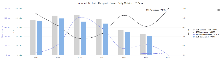
These charts allow for display of multiple metrics for a specific queue / aggregate queue. In much the same fashion as for Metric Progress charts above these charts can be replicated and adjusted using the wand symbol in the top right-hand corner of the chart.
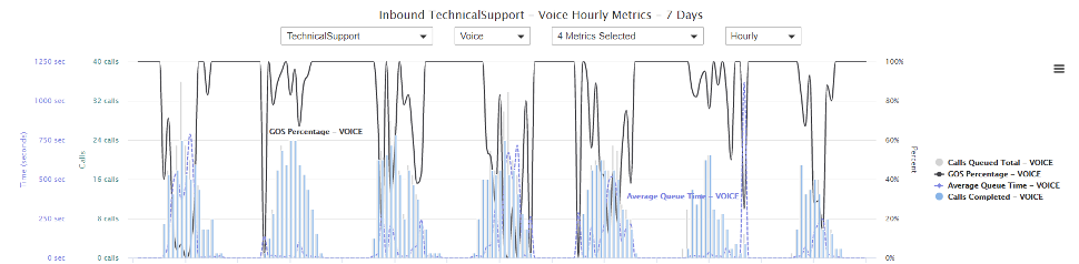
Metrics can be displayed with a daily or hourly calculation interval as below:
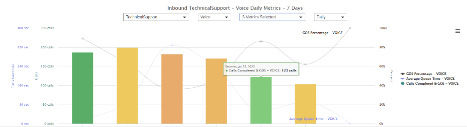
In addition to standard metrics, this chart also allows for a GOS colored “Calls Completed” metric. The height of the metric displays the number of calls and its color (red / orange /green) aligning to the GOS for the interval period calculated. In chart below the highlighted metric had 123 calls answered. The green color signifies a well performing GOS. To know exact value of GOS this can also be charted as below:
Using GOS colored metrics allows for an hourly chart as below. At a glance, one can deduce the performance of the queue as follows:
- Red colored bars are ones where callers are waiting long in queue above the
- Difference in height between grey bar (calls queued) and colored bar (calls completed) gives an indication of number of calls abandoned. This can also be explicitly charted:
