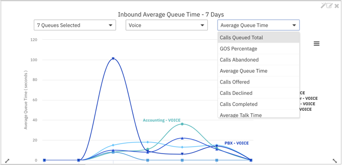
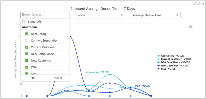
This chart allows for queue metric comparison across days for aggregate and standard queues. In the diagram below average queue time is calculated across days for 7 queues. Of note, one of the selected queues is the aggregate “All Queues”. This allows for an "at a glance" comparison of queues against the rest of the contact center.
The metric progress chart can also be replicated by clicking the wand symbol.
This allows for several progress charts with the flexibility of different metrics/queue/media type selections in multiple charts in the same dashboard. (E.g., view average queue and talk time across the same queue selection for the last 7 days)